Sunday, November 27, 2016

Developing My Information Graphic Outcomes (Pt. 1.4)

I continued finishing my graphics; this time with the local facts.

I started off with this fact:
HK has the highest income gap between the rich and poor in any developed economy

Using the YouTube channel I used before (Presentation Process), I found another very interesting chart called 3D Steps and decided to use this chart to show the income gap between the rich and poor. Again, I followed this tutorial step by step to create my own 3D Step. Through this tutorial, I found out about how you can make a 2D shape look 3D really simply and how PowerPoint actually has tons of functions that most people overlook.

My 3D Steps graph looked like this:
(I added silhouettes of poor people and rich people- edited in Photoshop)


My next fact was:
1 in 5 people live in poverty- poverty line is $3275 HKD per month

Similar to the world map animation I did before, I again zoomed into the subject this fact is focusing on- the poor and then presented the fact. It looked like this:


My final two facts were:
1 in 3 elderly struggles to meet their basic nutritional needs and
1 in 4 children don’t get 3 meals a day

I presented them similar to the way I did my trial animations on (text flying in from different directions with a bounce ending). Instead of writing "1 in 3 elderly", I decided to find silhouettes of the elderly, edit them in Photoshop and then highlight 1 elderly out of the 3. I did the same with the 1 in 4 children.

They looked like this:


The black boxes surrounding the text are to make the text more kinetic in the actual video.

My final video:

Saturday, November 26, 2016

Developing My Information Graphic Outcomes (Pt. 1.3)

After finishing number three of my plan, I decided to work on number one and two together. I started off with number 1.

Firstly, I made a title which looked like this:


Then animated it by making it fly in together:


Next, I worked on the first fact which was:
1 in 9 people on Earth do not have enough food to lead a healthy life- this is equal to 795 million people

I decided to present this fact with a world map with nine people lined up and then one person is highlighted to show the 1 in 9 people part.


My next fact was:
Asia is the continent with the most hungry people with 2/3 of the 795 million

I presented this using the world map I created right before by zooming into Asia and then giving the information. I had to watch this tutorial to learn how to zoom into a part of a picture with it looking neat, clean and professional. I found this really helpful and this was what it looked like:


After this, I had to research some cool pie chart types for this fact: 
Poor nutrition causes 45% of the deaths of children under five- 3.1 million children a year

I went on this YouTube channel called Presentation Process and looked through their chart making on PowerPoint playlist for inspiration. I found a tutorial to make a filled sphere, this tutorial was again really helpful and I basically relied on this completely to make this chart:


Friday, November 25, 2016

Developing My Information Graphic Outcomes (Pt. 1.2)

Today, I decided to start with the easiest task which is number three from my plan. I emailed my group member when I was making my plan and she promptly sent me the pictures so I didn't have to worry about the 'getting the pictures' part.

I started off with making the title/cover page which looked like this:


I made this by putting a picture of FHK's office in the background, added a borderlines and white circle to the slide, aligned it in the middle and the center then typed my text inside the circle using text-boxes. I decided to change the colour of the word 'Feeding' to make it stand out more as I think this word is pretty important compared to the other words. The font I used was Lato Thin and Bebas Neue and I used contrasting colours against the background.

Then I added the pictures to a new slide and added a light rectangular box to border each slide. I did this to make the slide look less bland and even decided to change the background colour to a black and the elements inside the slide to a white or a grey so that I will have a different colour scheme.

Next, I added my caption describing the picture and added a simple border to the caption again. It looked like this: 


Next, I animated everything with mainly the same animations for each captioning slide (fly in for everything but at different intervals and directions)


Finally, I added some background music, I used a track called Make it Shine and this is a soundtrack that I hear on YouTube videos a lot and I think that the happy mood of this soundtrack will fit with the video graphic. I had to learn some new skills when doing this because it was my first time adding music. I learnt that you had to go to the Audio Tools tab and choose the option of~
- Hide During Show
- Play across slides
- Loop until stopped
- Rewind after playing
to get the perfect outcome.


After fixing some of the transitions to make sure that it moves on without a click of the mouse, I watched the presentation a few times and made some adjustments to the animations, transitions etc. Finally, I exported it as a video (wmv format) and converted it to mp4 format to fit my objective of making sure that my file format is supported my iMovie.

Here is my final outcome:


Thursday, November 24, 2016

Developing My Information Graphic Outcomes (Pt. 1.1)

I have started working on my final product today by planning what I will be doing, this is my plan:

1. HUNGER STATISTICS- GLOBAL
Use PowerPoint
- 1 in 9 people on Earth do not have enough food to lead a healthy life which is 795 million people
World map with people lined up

- Asia is the continent with the most hungry people which is 2/3 of the 795 million people
World map highlighting Asia

- Poor nutrition causes 45% of the deaths of children under five which is 3.1 million children a year
Filled sphere 

2. HUNGER STATISTICS- HONG KONG
Use PowerPoint
- 1 in 5 people live in poverty, the poverty line is $3275 HKD per month
Draw a "poverty line" and then people below and above it

- Hong Kong has the highest income gap between the rich and the poor in any developed economy
Draw a 3D Steps graph

- 1 in 3 elderly struggles to meet their basic nutritional needs
Three elderly and highlighting one out of the three

- 1 in 4 children don't get 3 meals a day
Four children and highlighting one out of the four

3. FEEDING HONG KONG PICTURES
1. Ask my group members for the pictures
2. Choose the best pictures
3. Caption them and animate them on PowerPoint

I will be using PowerPoint for all the graphics because I feel the most confident with PowerPoint and I think that I can make good graphics using a program that I am used to.

Wednesday, November 23, 2016

Understanding and Setting Objectives

Today, I learnt about the differences between an aim and an objective then set my own objectives for the following weeks.

I did an activity which helped me understand the differences between an aim and an objective. Below, I will summarise what I learnt from the ISLE page.

An aim is something general, broad and strategic- for example, to make a graph interactive.

An objective is something that is specific, clearly defined, allows aims to be achieved- for example, to make a graph interactive you can add in an option where the numbers only show if you hover over it.

Copied from website:

Objectives that support these aims would be:
Aim: To be technically proficient in terms of production and post-production
  1. To use tripods so that the camera is steady
  2. To shoot the same scene from a number of different angles
  3. To use a good quality microphone to record the dialogue
  4. To use additional lights when filming if necessary
  5. To use After Effects to add special effects needed
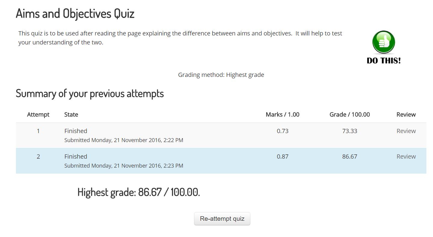
After reading sufficient information, I did a quiz on what I learnt. My result is listed below:
I think I did pretty well and that this activity really helped me to understand the differences between an aim and an objective because, before this, I would have thought they were exactly the same. I am now all ready to create my own aims and objectives!

Aim: Creating graphics for the documentary
Objective
1. Create at least 3 graphics that uses kinetic text or is a unique graph (not just simply a bar graph, pie chart, line graph etc.)
2. Use the skills I have learnt and practised in the weeks prior
3. Preferably use the program- PowerPoint
4. Make sure the files are in mp4 or AVCHD format so that the editor who uses iMovie can access them
5. Graphics must be related to our topic- hunger
6. One graphic has to be animating pictures we took from Feeding Hong Kong and captioning them using kinetic text
7. Has to be of a high quality- pleasing aesthetics, attractive, easy to understand

Later on, I looked at some collaborative dispositions and reflected on some of them.
I looked at this sheet linked here. I chose 3 dispositions from the green section that I think I am are currently good at, 3 task dispositions from the blue section that I think are the most important for my role and 2 dispositions from the red section that I need to work on in group situations.

Green Section
I think I am capable of being a translator because I usually try to explain things to people and make sure they completely understand what the group is talking about. Moreover, I think I am good at being an active listener because I always try to ask questions about new ideas and suggest how we could improve the new idea. Sometimes, I am an excellence controller in the sense that I tell people that I think their work can be of higher quality and tell them how they can improve.

Blue Section
3 dispositions that I think we be crucial to my role as an information designer is the out of the boxer, reality maker and specialist. This is because as an information designer, the graphics I create has to be innovative, creative and original, not only do they have to be inventive, they also have to be something that I can actually make with the particular skills and knowledge I have developed. Therefore, I think that these three dispositions fit in together nicely and is necessary for an information designer.

Red Section
2 dispositions that from the red section that I think I am and need to work on is the perfectionist and maybe also the blocker. I think these two dispositions are similar in a way because they both are rejecting and criticising someone's work because I think it can be improved and perfectioned. I feel like I am a perfectionist regularly whether or not I am in group situations; even with myself, I feel like my work is never good enough even though others say it is. However, I don't really think I am a blocker much because I usually hate it when people do that to me and I don't really see a point in blocking someone's work just because it doesn't fit my opinions.

Monday, November 21, 2016

Confirming my Outcomes

I confirmed my final outcomes in this lesson by emailing my director the work I had done in the previous weeks as an example of what I could do for the final documentary. I emailed her my kinetic typography I did the week before and also told her about how I could put some statistics we collected from our research into a graph format and present it in the documentary.

I am still waiting for her reply but if she doesn't reply, I think I will try to decide my own outcomes by myself based on what I think we are still missing on our video.

I will:
- Caption the pictures we took at Feeding Hong Kong using kinetic text
- Put some statistics into a kinetic text video graphic
- Create an interesting and maybe interactive graph showing the ratio between those in hunger in Hong Kong and those not or other statistics

These are some things that I will decide to do if my director doesn't reply before Wednesday.

Saturday, November 12, 2016

Developing Skills and Experimenting with Tools (Part Two)

This week, I developed my previous experimentation animation into a more professional looking animation. I decided to completely scrap my previous one because I wasn't pleased with it- the colour scheme, the font and the animations.

I heavily relied on this tutorial and found it extremely helpful and useful. I paid a lot of effort in this animation because I am hoping to include this in the final video if the director finds it worthy.

Here is my final product:


Steps I took to create that:
1. Deciding on my fonts and colour scheme:
I went to a website I usually use for colour combinations to find a suitable colour scheme
I decided to use fonts that I regularly use: Bebas Neue and Lato

2. Typed up my fact then formatted it:
I typed up my fact using the font and the colour scheme I came up with previously
Next, I adjusted the size of each word to fit the design I wanted to do

3. Animated my text
In this video infographic I only mainly used the fly-in animation and the fly-out animation and occasionally the line motion-graphic tool

4. Made my graphic look more "kinetic"
I achieved this by creating some rectangular boxes and then placing them next to the text so that when the text flies in, it looks like it is suddenly emerging out of nowhere.

5. Export
After I animated everything, played it a couple of times, adjusting bits and bobs etc. I exported the PowerPoint presentation as a video

Overall, I think I made good progress this week, I am pretty pleased with my finished graphic. I think the style of this graphic is pretty eye-catching and will be suitable for the final video. Some things I could improve on for next time is to include appropriate music in the background.