Information Designer Meeting
In order for my information designer to know which parts of our secondary research should be made into visual outcomes, I held a meeting with him to discuss our plans.
Firstly, prior to the meeting, I identified 2-4 pieces of information from our group's secondary research that can be turned into something graphical and visual. I had these in mind during the meeting.
During the meeting, I showed him the statistics I identified and talked to him about the ways we could present these visually. We discussed whether or not we should be including other sorts of facts too and finalised our ideas.
After the meeting, I sent him a list of our chosen statistics which included statistics on how much food we waste on a global scale, a comparison of the amount of food wasted in HK and other countries, as well as the composition of Hong Kong's municipal solid waste. These are the chosen ones because not only are they valuable towards the documentary but also because they can easily be presented in a visual form through pie charts or graphs.
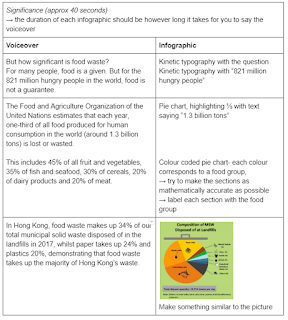
However, when I started to write the script for the voiceover for the video, I realised that I needed some other bits of information for the information designer to present visually. I conveyed these over to him after the meeting and also created a document for him to refer back to make sure everything we discussed in the meeting was clear.
This was what the document looked like and it clearly outlined what infographics I was hoping he could achieve. Each row was for a different section in the voiceover and I also gave him brief timings so that the voiceover and the infographics would match up.

After the meeting, I sent him a list of our chosen statistics which included statistics on how much food we waste on a global scale, a comparison of the amount of food wasted in HK and other countries, as well as the composition of Hong Kong's municipal solid waste. These are the chosen ones because not only are they valuable towards the documentary but also because they can easily be presented in a visual form through pie charts or graphs.
However, when I started to write the script for the voiceover for the video, I realised that I needed some other bits of information for the information designer to present visually. I conveyed these over to him after the meeting and also created a document for him to refer back to make sure everything we discussed in the meeting was clear.
This was what the document looked like and it clearly outlined what infographics I was hoping he could achieve. Each row was for a different section in the voiceover and I also gave him brief timings so that the voiceover and the infographics would match up.


No comments:
Post a Comment